Principal User Journey
Next, I designed the initial screens for the website, leveraging my research and planning to inform the UI, microcopy, and overall brand voice. I created screens for the principal user journey, including the homepage, beauty quiz start page, sign-up page, product page, checkout page, and order confirmation page. Swipe through the slides below to view each screen.
-
![]()
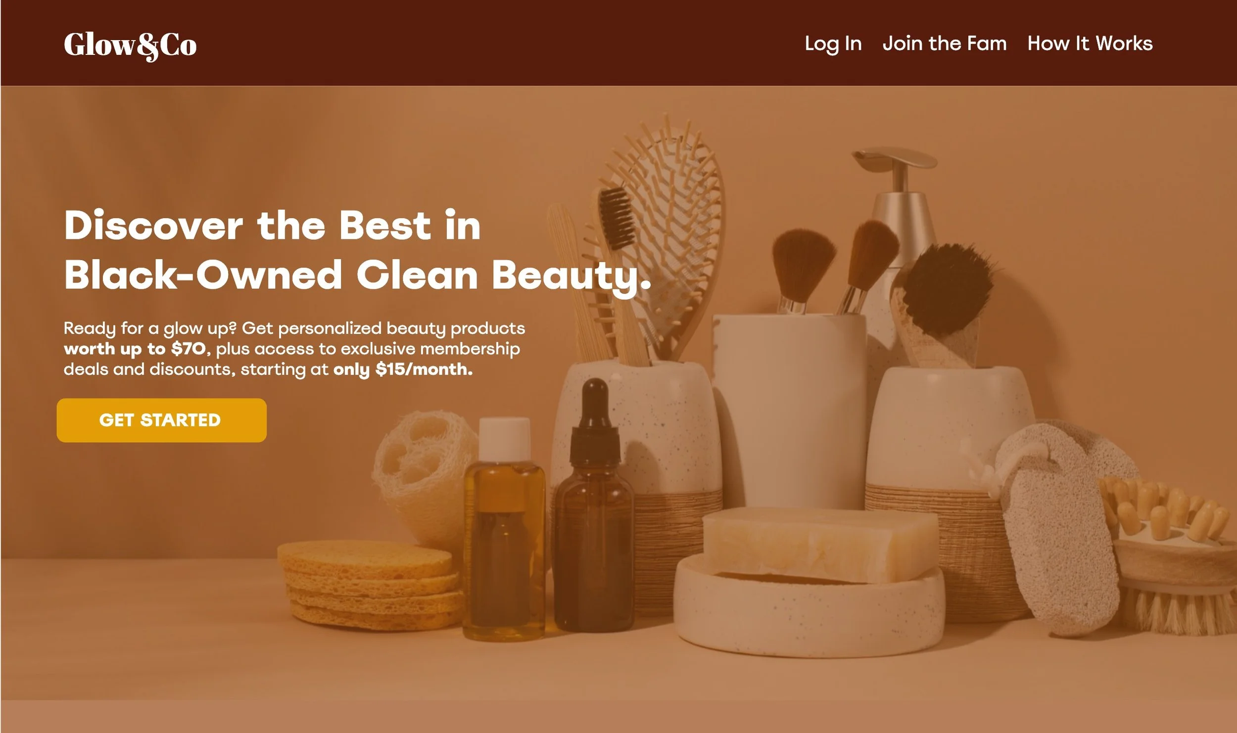
Homepage
Headline: This is the first opportunity to grab the user’s attention and tell them what our product is. “Discover the best in Black-Owned Clean Beauty” communicates the main goal and benefit of Glow&Co—helping users who are interested in clean beauty and Black-owned beauty discover products that are a perfect mix of the two.
Body copy: The first line, “Ready for a glow up?,” connects directly to the product’s name, feels down-to-earth, and uses a phrase that our users are familiar with. The rest of the copy concisely explains the product while highlighting the value proposition (”products worth up to $70…starting at only $15/month”) and membership perks, both of which are important to our users.
CTA: The CTA is action-oriented yet open-ended—encouraging the user to “get started” implies that they will be brought into an experience and learn more about the product, rather than “subscribe” which forces users to think about the final purchase before they even know much about the product.
-
![]()
Beauty Quiz Start Page
Headline: The headline clearly communicates this step in the process, while still feeling conversational and supportive.
Body copy: This copy explains more about why the user is being asked to complete this quiz. Rather than framing it as “we want to know what you want in your box,” it’s framed as “we want to get to know you better so we can optimize your experience” which sounds more approachable.
CTAs: The primary CTA is straightforward and lets users know what will happen when they click it, while the secondary CTA gives users to option to skip, offering agency and choice.
-
![]()
Sign Up Page
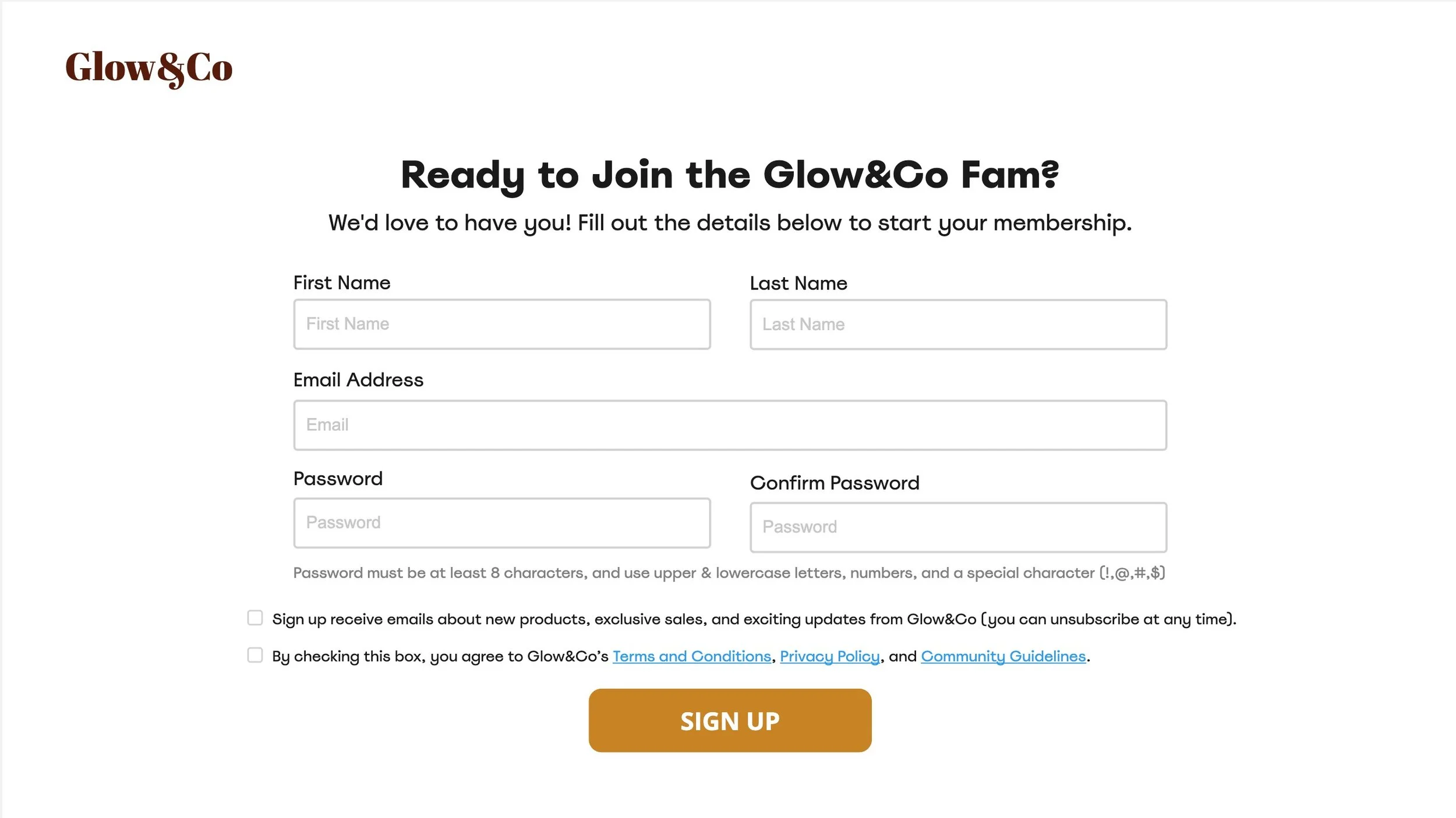
Headline: The header is fun, down-to-earth, and community-oriented, letting users know that they’re not just signing up for a beauty subscription—they’re joining a community based on empowerment and support—like a family!
Subheader: The subheader continues to welcome the user while giving them clear information about what filling out the form will lead to.
Checkboxes: There are two checkboxes—one that lets users opt-in to Glow&Co’s promotional emails (and highlights the benefits of doing so), letting them know they can unsubscribe at any time, and a required checkbox for users to agree to our terms and conditions, privacy policy, and community guidelines.
CTA: The CTA is clear and action-oriented, letting users know what will happen when they click it.
-
![]()
Product Page Tab 1
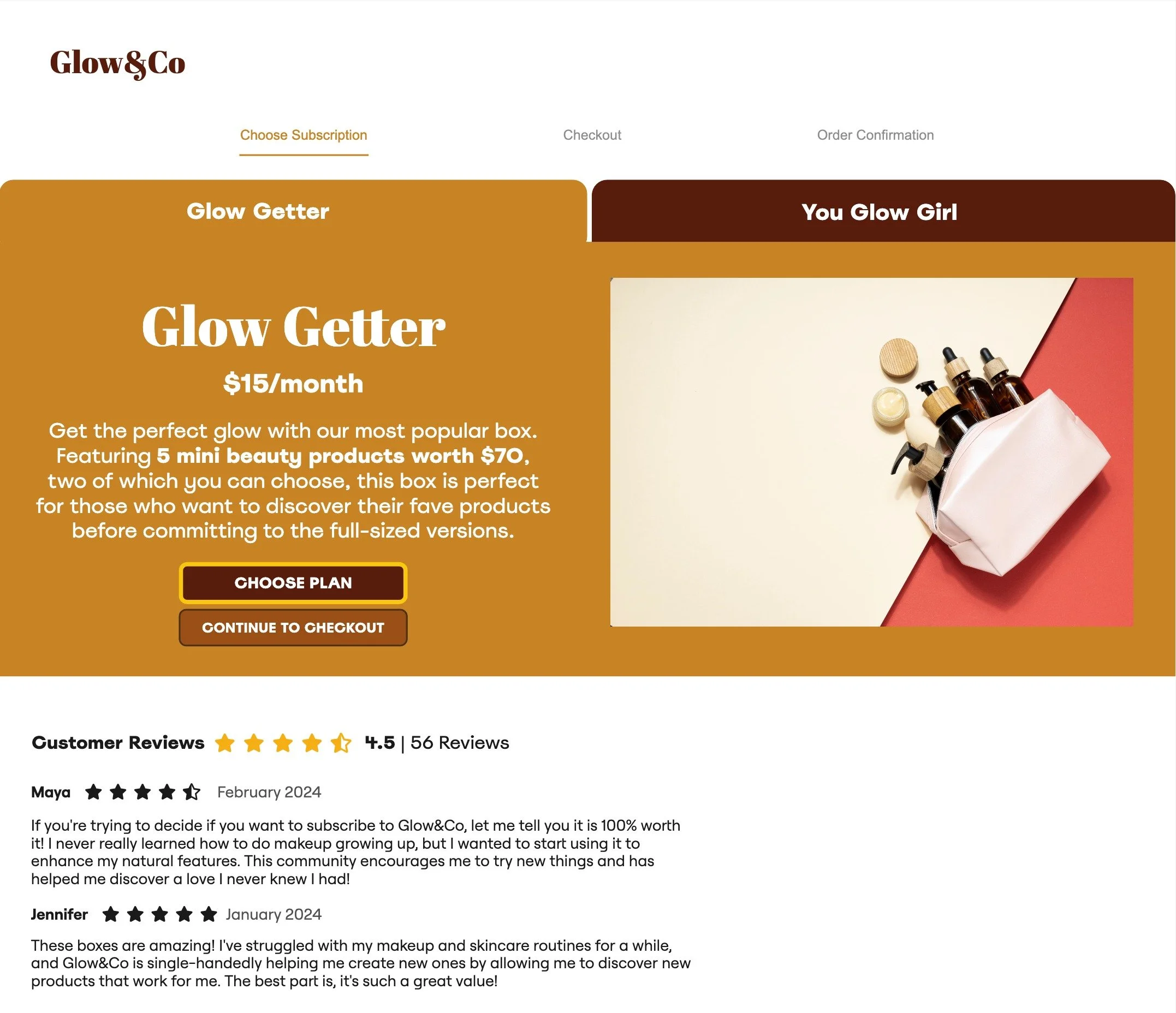
Since this is a subscription-based product, the product pages show the two subscriptions available to users—”The Glow Getter” and “You Glow Girl,” letting users switch between the two tabs to easily compare the features and benefits.
Header: The name of our first subscription tier, “The Glow Getter,” is representative of our voice & tone guidelines while speaking to the goal of the product—helping users discover products that get them that glow!
Subheader: The subheader is just the price—$15/month. It’s clearly indicated, in large text, and contains no surprises.
Body copy: For my product description, I used the Features-Advantages-Benefits copywriting formula, telling users what our product is, why it’s helpful, and what it means for them. The product description is written according to Glow&Co’s voice & tone guidelines—it’s fun and exciting without being overly cheery and it shows users that we understand how important it is to try a product before you commit to it.
CTAs: The primary CTA is “Choose Plan,” and if users select that, a secondary CTA appears with the option to checkout.
Visuals: This is a stock photo, but I envision a slideshow of images of boxes from previous months, as well as unboxing videos and customer images.
Reviews: Include reviews to give users more insight into other users’ experiences with the product and build trust and confidence in our brand.
Progress Tracker: I’ve included a progress tracker at the top which shows users the whole checkout process from choosing their subscription to confirming their order.
-
![]()
Product Page Tab 2
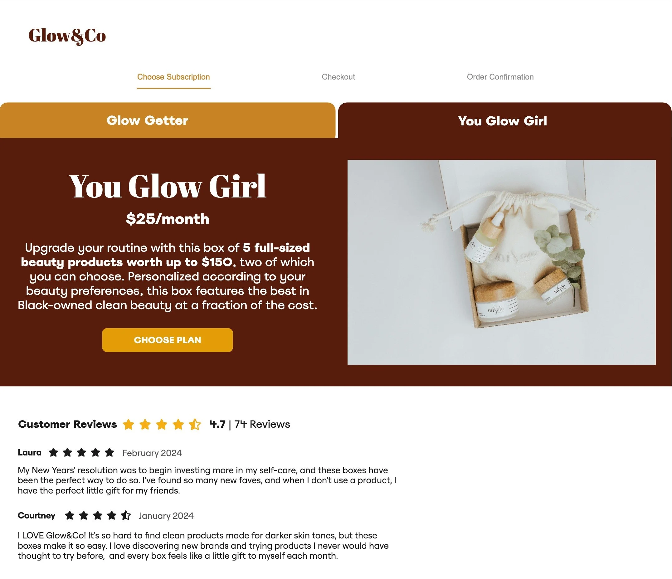
Header: The name of our second subscription tier, “You Glow Girl” is empowering, supportive, and joyful—just like our brand’s voice & tone guidelines outline.
Subheader: The subheader is just the price—$25/month. It’s clearly indicated, in large text, and contains no surprises.
Body Copy: For my product description, I used the Features-Advantages-Benefits copywriting formula, telling users what our product is, why it’s helpful, and what it means for them.
CTAs: The primary CTA is “Choose Plan,” and when users select that, a secondary CTA appears, allowing them to click through to the checkout page.
-
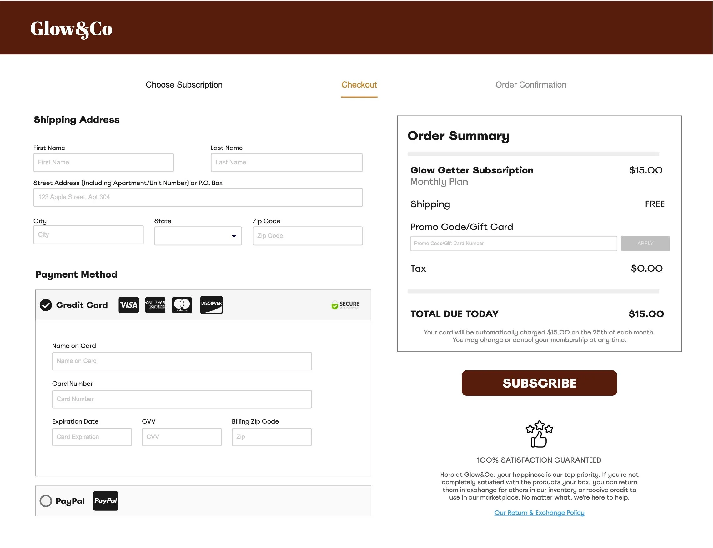
![]()
Checkout Page
Order Summary: The order summary clearly outlines all the costs and the final price. Below the total, I’ve also included a note that clarifies how much users will be charged each month and on which day their card will be charged, and reassures them that they can change or cancel their subscription at any time.
Payment Methods: There are two payment methods—credit card and PayPal—each of which uses trust badges to communicate security and increase conversions.
Customer Satisfaction Guarantee: Below the subscribe button, there is copy that details the importance of customer satisfaction at Glow&Co. We touch a bit on the return policy, but mainly, we assure users that we’re here to make sure they’re happy, no matter what. Below the copy, I include a link to our full return policy, which will open a pop-up.
-
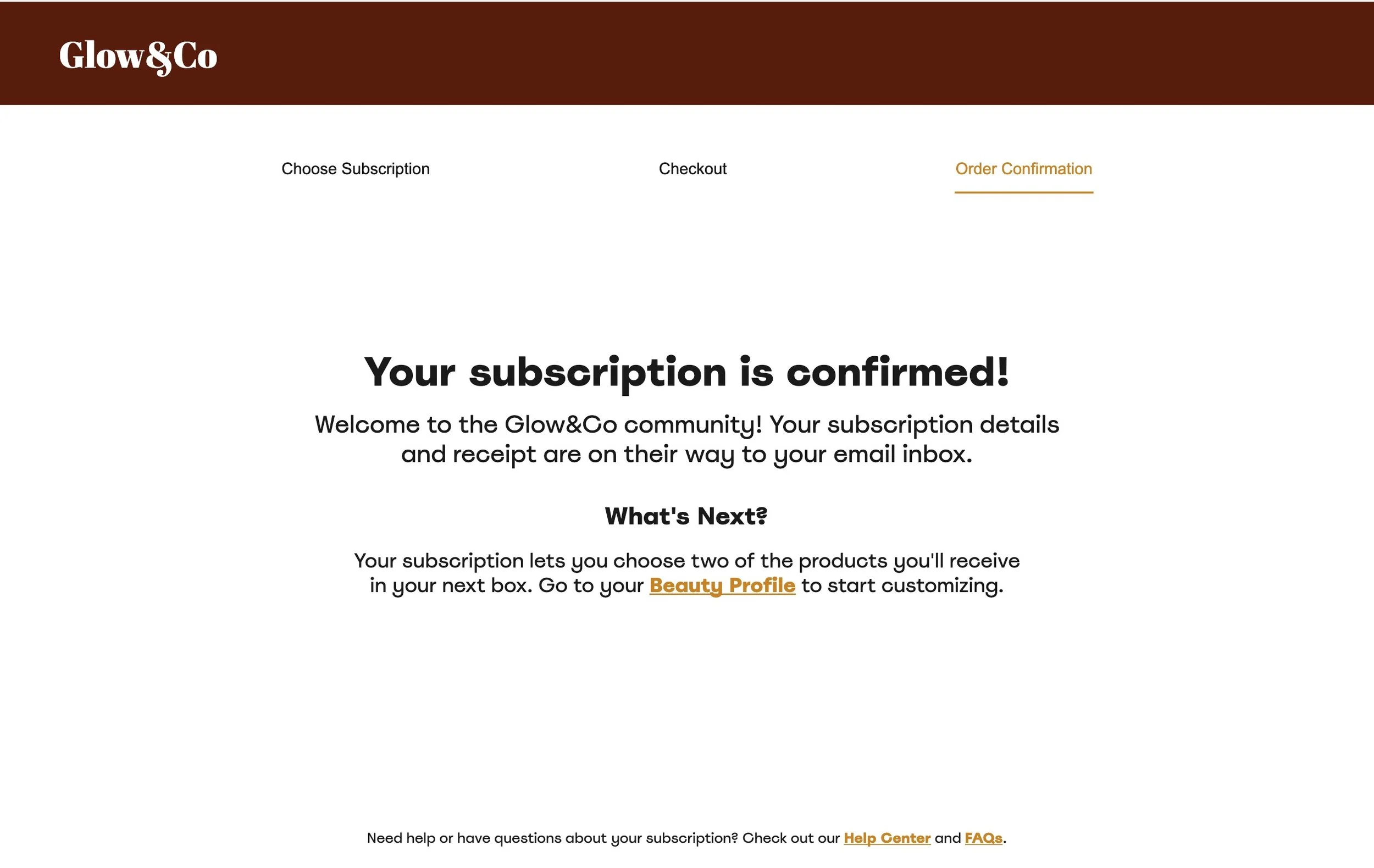
![]()
Order Confirmation Page
Header: Confirms that the payment went through and that the user is officially subscribed to Glow&Co!
Subheader 1: The subheader welcomes users to this fun, new community, while making sure essential details about their order confirmation and receipt are still communicated.
Subheader 2: Now that users have subscribed, they may be wondering what to do while they wait for their box.
Body Copy: Luckily, one of Glow&Co’s features lets users choose two of the products they’ll receive in their upcoming box. The body copy explains this feature again, and tells them where to go (and includes a link!) to start customizing their box.
Footer: Finally, I’ve included links to our Help Center and FAQs for users who need additional guidance.